Brisa
Brisa
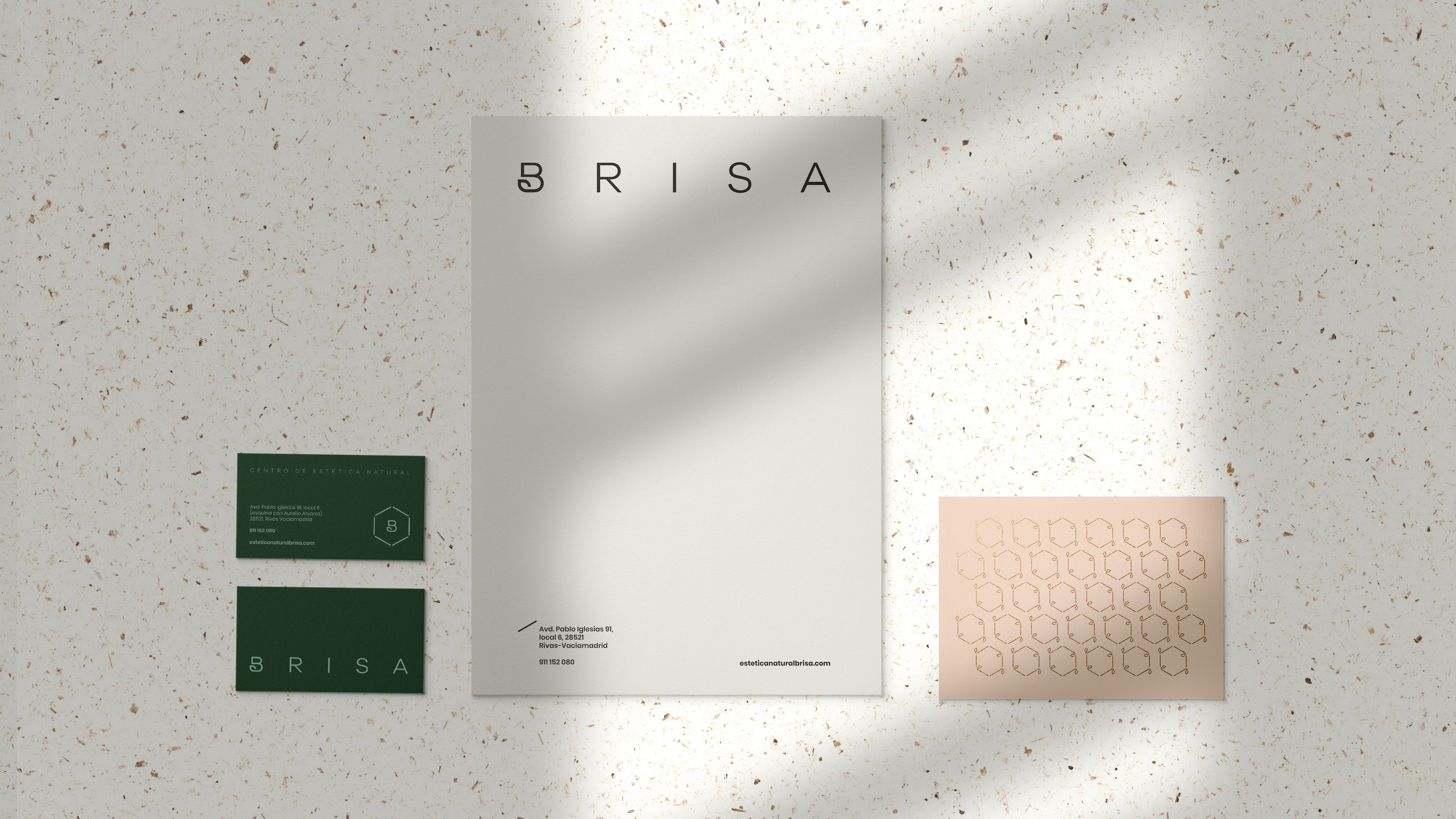
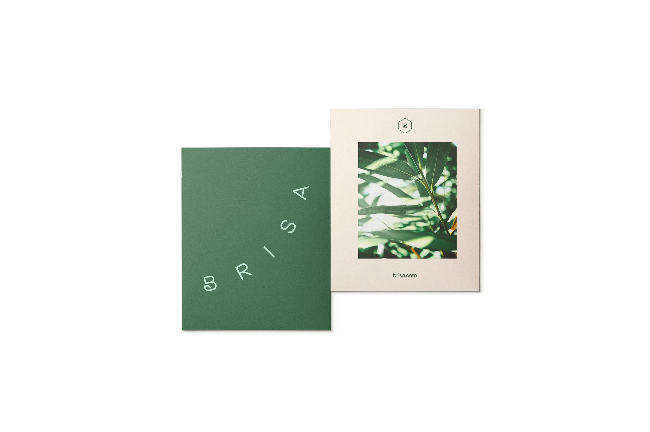
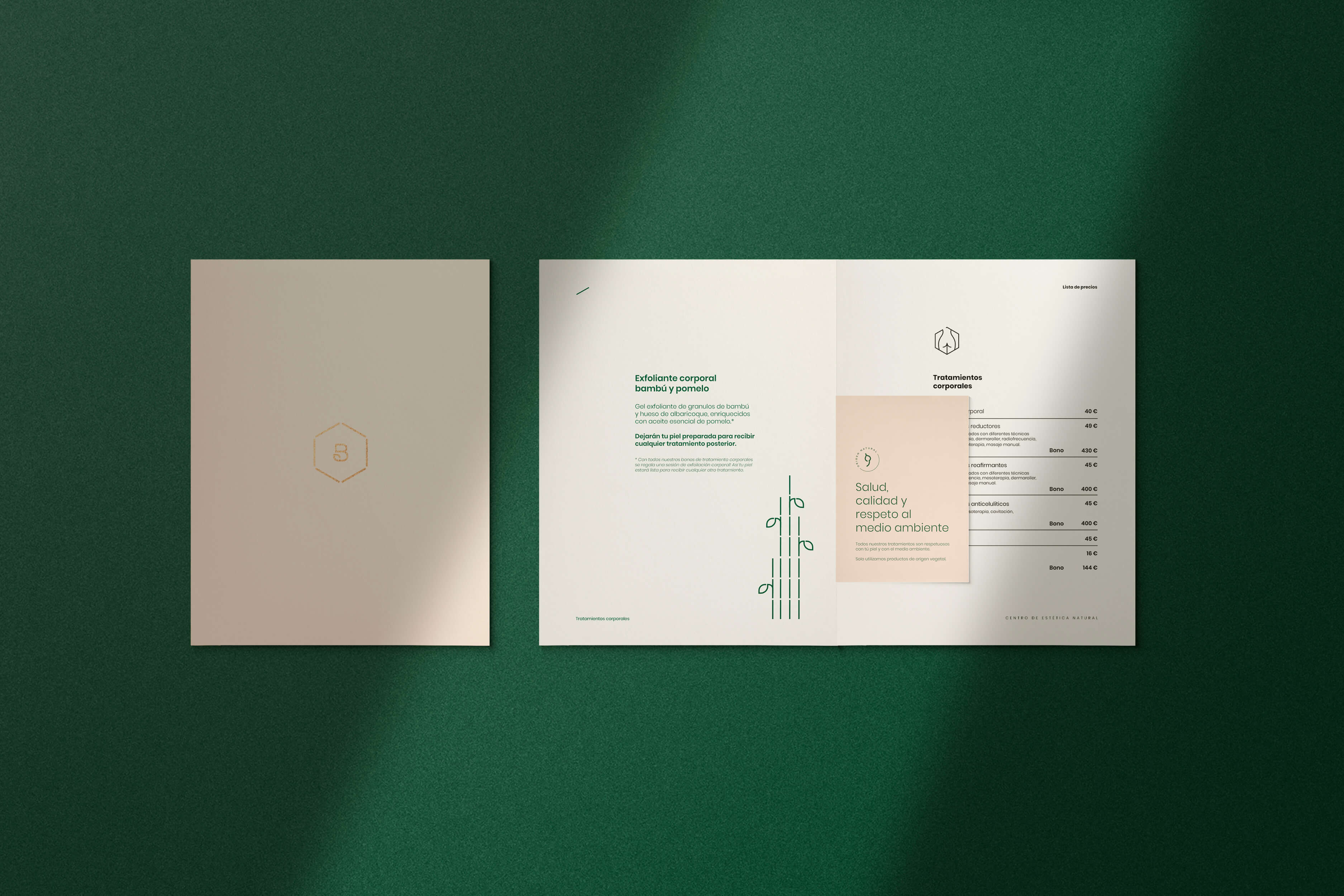
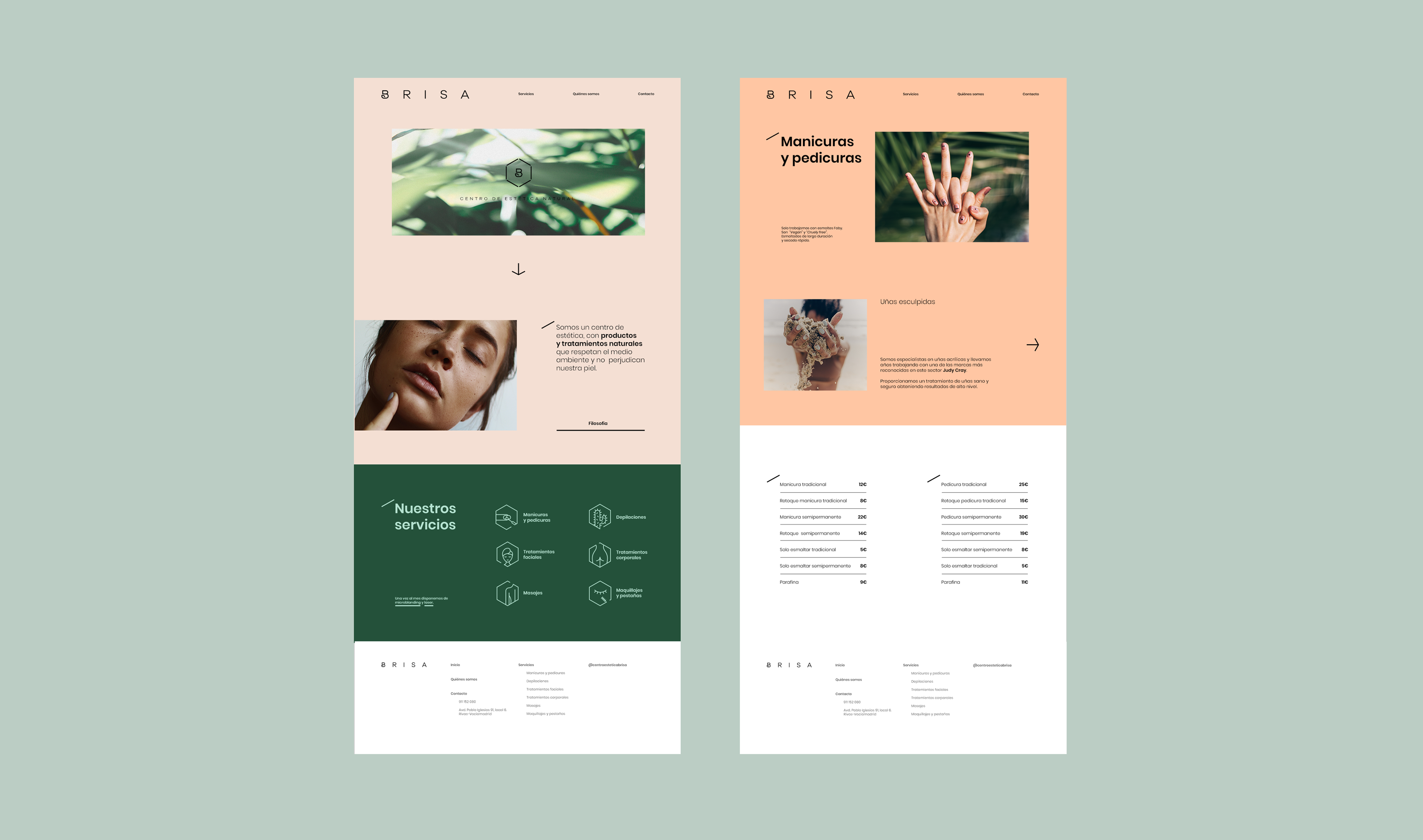
Brisa is a natural and ecological beauty center. It is known for mixing traditional techniques with the most advanced technology. It always takes into account the environment in any of its treatments, using only natural cosmetics and ecological products.
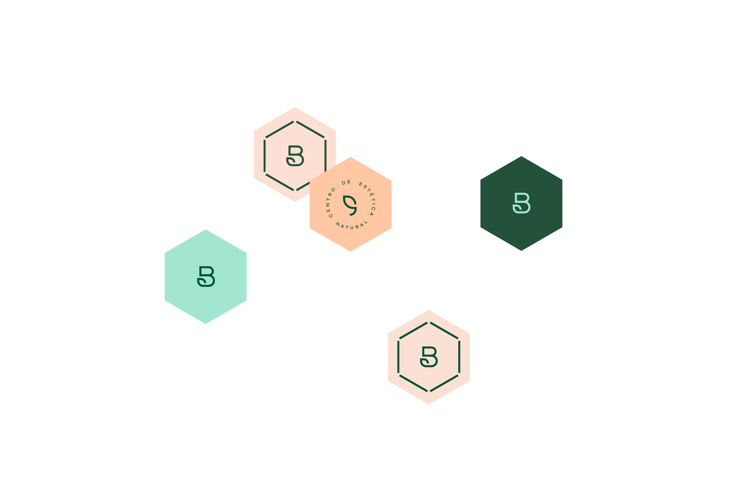
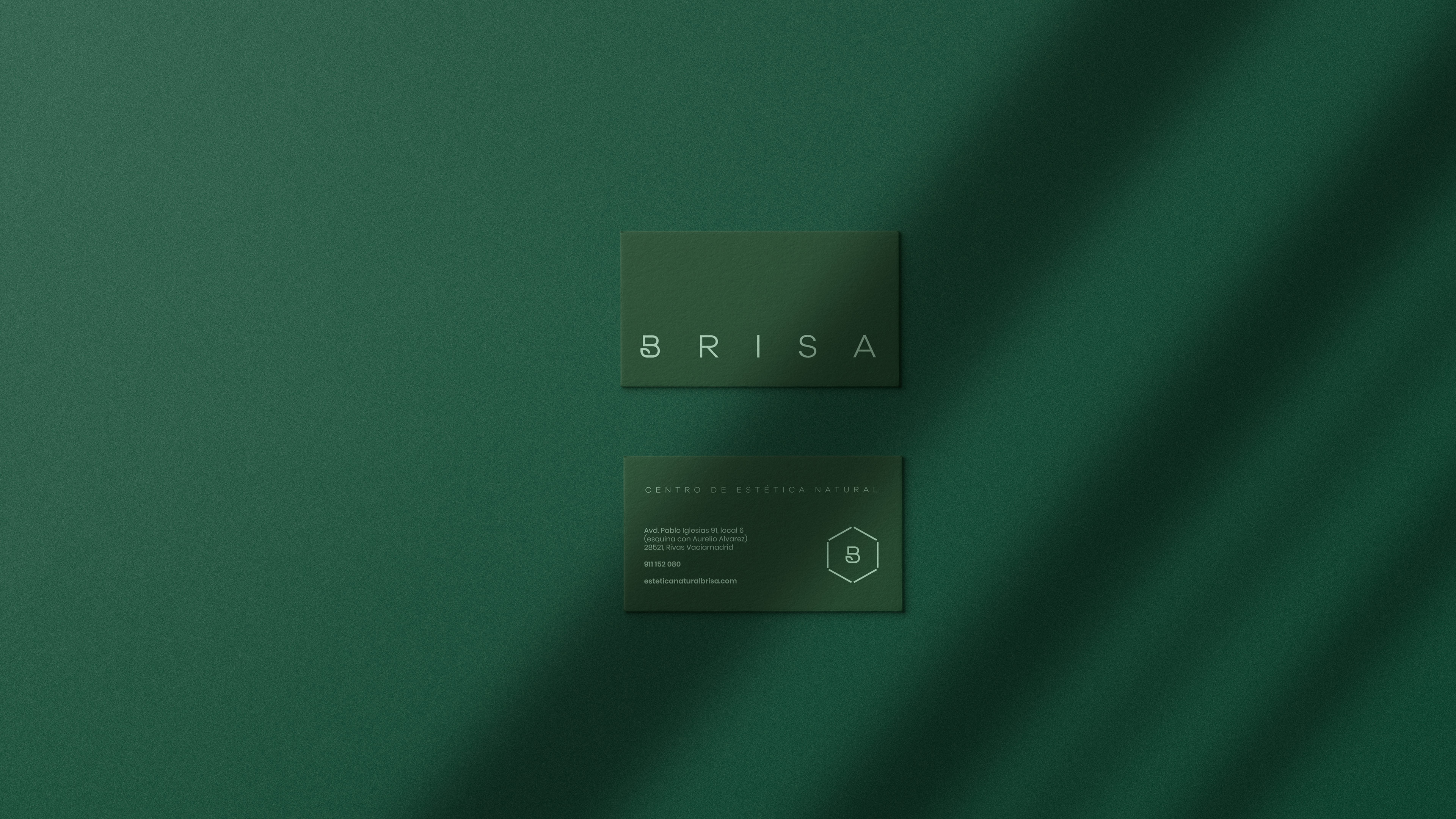
The B in the logo was used to represent nature. The logo also uses wide spacing, allowing the letters to breathe. A light and delicate logotype is formed, fully connected to the brand’s philosophy and name.
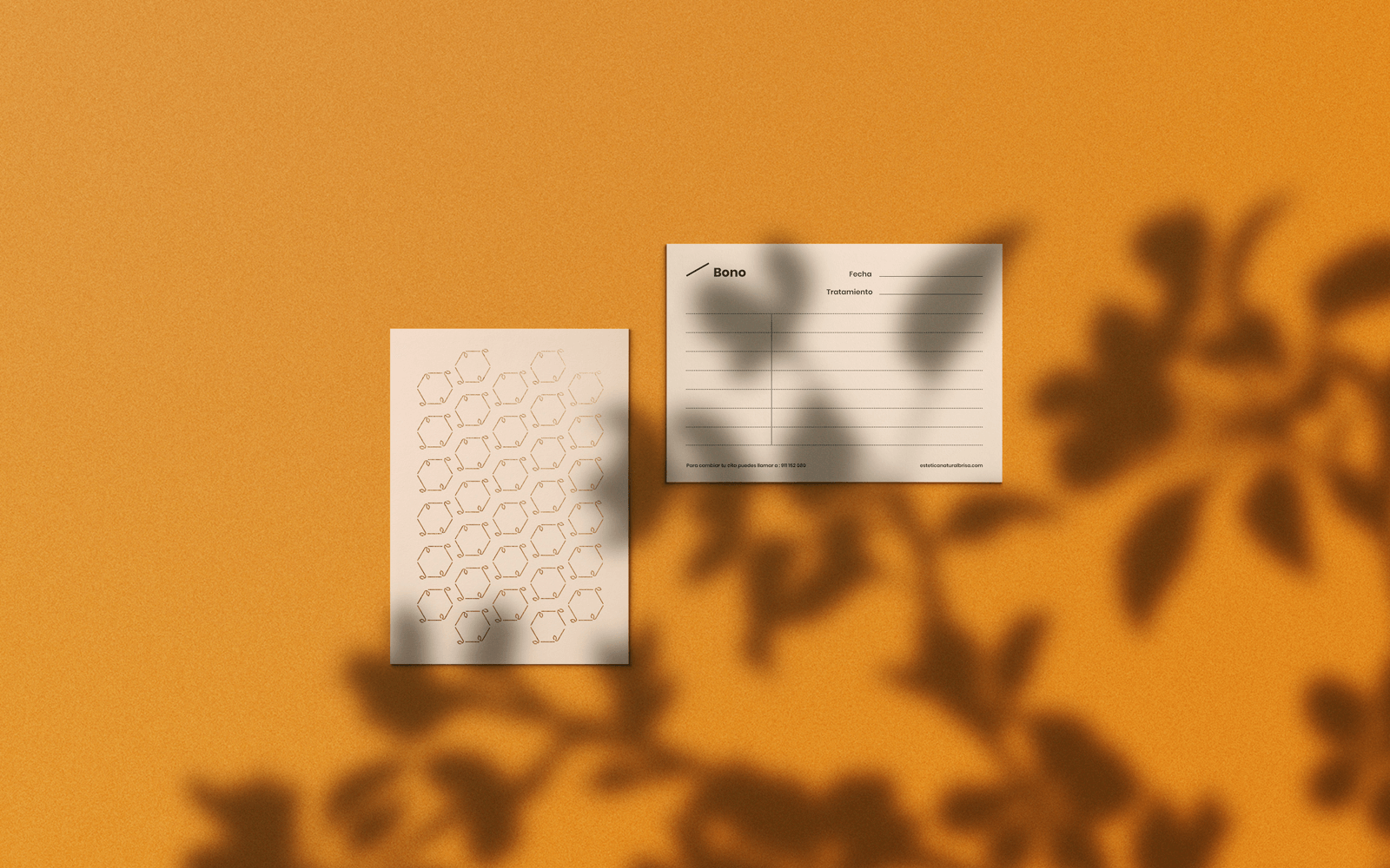
In addition to the logo the brand is accompanied by a visual world with a range of colours that reflects nature and delicacy. In the creation of symbols and patterns, the spacing is also maintained, allowing itself to breathe. We connect in a simple way the importance of the skin (skin cells are represented as hexagons) and the effects of nature upon it.
Freelance project for Brisa, Natural aesthetics center.
©DobarroBello2023
©DobarroBello2023
©DobarroBello2023
©DobarroBello2023
dobarrobello@gmail.com
dobarrobello@gmail.com
dobarrobello@gmail.com
dobarrobello@gmail.com
dobarrobello@gmail.com